Blog post looks at using Video Intelligence API (in Python) from Google Cloud to track objects within a video.
All in data science
R Programming: Combine Boxplot and Scatterplot Into Single Visualization
This blog post looks at combine boxplots and scatterplot (via geom_jitter) into a single visualization within Ggplot / R Studio
BigQuery ML + Google Analytics: Forecast sales For Multiple SKU's Using A Single Query + Model
Blog post uses Google Analytics merchandise store demo data in BigQuery to forecast the expected quantities that will be sold for two particular SKU’s. Uses BigQuery, BigQuery ML and DataStudio.
BigQuery for Google Analytics App + Web: Get User Counts By Date Between Two Fixed Dates
BigQuery example to extract Google analytics app plus web User counts by date between two fixed dates.
Experimenting With Google Cloud Vision API for Landmark detection In Images
Blog post looks at using the default Vision API from Google Cloud to run tests and detect landmarks in images.
BigQuery Google Analytics App + Web: Query User Count Where Medium Matches Parameter
Blog post looks at using the key/value pairs in event parameters within Google Analytics app plus web event hits to extract user count
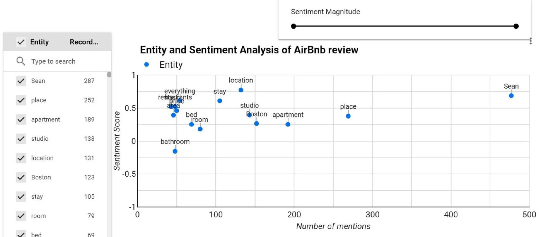
Entity and Sentiment Analysis On Website Survey Text Data Using Google Cloud Natural Language API
Blog post uses sample website survey text data to analyze the entities [what is being spoken about] along with the sentiment across the mentions, using Google Cloud Natural Language API module + Google sheets + Google Apps script.
E-commerce Product Recommendations: Apriori algorithm (Items frequently bought together): A basic explanation of how it works
This blog post helps explain the apriori alogirthm in a simple way, using examples from a fictional store with three items.
BigQuery ML: Time Series Forecasting Using Google Analytics App+Web Data
Blog post looks at examining the forecasting a time series for user values for a sample GA App+Web property using BigQuery and Data Studio
E-commerce Product Recommendations: Apriori algorithm - Market Basket Analysis for Product Recommendations Via Orange Platform
Blog post looks at using Apriori add-on in Orange platform to find association rules between products frequently purchased together and show ideal product recommendations.
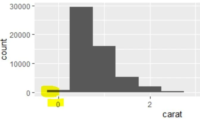
R / Ggplot Geom_histogram - How to make histogram bins start at zero
Use boundary and centre parameters in geom_histogram to make histogram bins start at zero.
How To Switch To Linear Regression In a Ggplot Geom_Smooth - R Programming
Blog post on how to switch from a LOESS trend curve in a Geom_smooth to a Linear equation within R programming.
Create a Ggplot Geom_bar With Position = Dodge AND As Percentage of Type on X Axis In R Studio
Blog post discusses using the diamonds dataset to create a geom_bar with percentage share of the x in a position=dodge within R programming
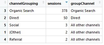
How To Conditionally Group Google Analytics Channel Data In R Programming
R script that uses as base R to run IF / ELSE check on a column (channel) and then assign a value in a new column.
Analyze Bounce Rate, Page Load Time By Devices In R Studio
Blog post looks at pulling data and then applying several ggplot2 geoms to graphically show the relationship between bounce rate, page load time and device category
How To Create a Sankey Diagram With Google Analytics Data In R Studio
Create a basic behaviour flow chart using Sankey diagram with Google Analytics Channel and landing page data.
How To Calculate Month-On-Month Change In Website Traffic In R Studio
Code uses ggplot to visualize change + mutate function to create a calculated field [% change in sessions]
Exploratory Data Analysis Of Google Analytics Data In R Studio
Blog post covers exploratory data analysis function in R studio to provide summary metrics on Google Analytics data.

![Google Cloud Video Intelligence API - Object Tracking in Python Example [Single Video]](https://images.squarespace-cdn.com/content/v1/5640e86be4b031347f7c7b81/1602260758648-N211DUBPXML3TZP3M4C6/Google+Cloud+Video+Intelligence+API+Python+sample+object.JPG)


