How To Calculate Month-On-Month Change In Website Traffic In R Studio
In order to plot this chart, what you’ll need:
ggplot
dplyr package + mutate function to create a calculated field [% change in monthly sessions]
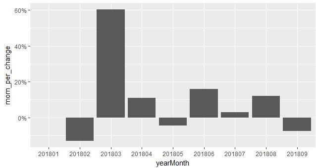
In order to get the end result like this:
We first use the GoogleAnalyticsR package to pull the data from GA. Here, I have Sessions + yearMonth data for all of 2018.
We then call the library dplyr and use the mutate function to create a calculated field [month-on-month change] that shows the % values.
library(dplyr)
#new column added using a calculated field
gadata<- gadata %>%
  mutate(mom_per_change = (sessions - lag(sessions))/lag(sessions))
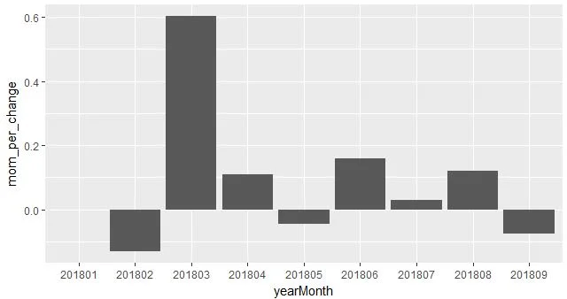
As you can see in the chart, the y axis has the change in decimal format instead of percentages.
Adding the scale_y_continuous parameter to the ggplot now converts the y axis to percentage format.
#number format changed to show Y axis as %
ggplot(gadata, mapping=aes(x=yearMonth,
      y=mom_per_change)) +
        geom_col() +
           scale_y_continuous(labels = scales::percent)
#Full code
library("googleAuthR")
library("googleAnalyticsR")
library("ggplot2")

ga_auth()
ga_account_list()


ga_id <- 1234567

gadata <- google_analytics(viewId = 1234567,
    date_range = c("2018-01-01","2018-09-21"),
    metrics = c("sessions"),
    dimensions = c("yearMonth"),
    anti_sample = TRUE)

gadata

library(dplyr)

#new column added using a calculated field
gadata<- gadata %>%
  mutate(mom_per_change =
  (sessions - lag(sessions))/lag(sessions))

gadata

#Plot created to show % change
ggplot(gadata, mapping=aes(x=yearMonth,
  y=mom_per_change)) +
  geom_col()

#number format changed to show Y axis as %
ggplot(gadata, mapping=aes(x=yearMonth,
  y=mom_per_change)) +
  geom_col() +
  scale_y_continuous(labels = scales::percent)


![How To Create Google Analytics Segments [Conditional Data Pulls] In R Studio](https://images.squarespace-cdn.com/content/v1/5640e86be4b031347f7c7b81/1527536580402-ELT919HGY0OMMWE1G7P4/Rplot01.jpeg)

