How To Switch To Linear Regression In a Ggplot Geom_Smooth - R Programming
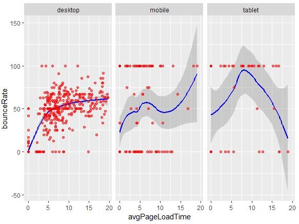
So, a while back, I had done a post on showing the relationship between Bounce rate and Avg. Page load time via a Ggplot geomsmooth + facet_wrap. The plot came out like this:
I had to reuse this type of data and thought if it can be improved. Sometimes, showing less can be better.
In above viz, the Load Time = 0 and Bounce Rate = 100 make it a bit harder to read.
The curve can be somewhat confusing
The grey shaded area can add to some of it
Overall, there’s a lot happening with the viz. Let’s see if we can try to make it better.
First, let’s remove the extreme values where page load time > 10 and remove the ones where load time = 0
AND the ones where Bounce rate was 0 or 10. This is done by using the SUBSET function to take the existing full dataset but only pick the values where it meets below 4 conditions.
ggplot(subset(gaData,
avgPageLoadTime > 0 &
  avgPageLoadTime <10 &
  bounceRate >0 &
  bounceRate <100))
We are now creating a ggplot geom_point where I want to show the Avg. Page Load Time on X axis,
the Bounce Rate on Y axis and split it by Device Category via facet_wrap. On top of this, add a geom_smooth to show the trend. Show the line in red, fix the X axis scale at max 10 across all three device categories.
Mainly, use method=”lm” to show linear modelling instead of LOESS and SE=FALSE to hide the grey area. Solution via StackOverflow.
geom_smooth(mapping=
   aes(x=avgPageLoadTime,
   y=bounceRate),
  colour="red",se=FALSE,method="lm")+
  geom_point(mapping=
             aes(x=avgPageLoadTime,
 y=bounceRate),
 colour="blue",alpha=0.5) +
 facet_wrap (~deviceCategory,
             nrow=1,scales="fixed")
The grey area [SE=TRUE] would be a zone that covers 95% confidence level [that the values will be within that area]. https://ggplot2.tidyverse.org/reference/geom_smooth.html [Level=95% by default, can be increased to 99%]. Switching it to SE=FALSE hides it.
Once you combine the above code, you’ll get a below type output for your GA data. Quite different from LOESS method. Showing a linear regression line would sometimes be better. Will explore more details about LOESS method and comparison with Linear Regression in a separate post.
Full script below.
#install and load packages
install.packages("googleAuthR")
install.packages("googleAnalyticsR")
library(googleAuthR)
library(googleAnalyticsR)
library(ggplot2)
library(googleAuthR)

ga_auth()
ga_account_list()
#Your GA view ID goes here. Change from 1234567
viewId <- 1234567

#2018-2020 dataset
gaData <- google_analytics(viewId = viewId,
date_range = c("2018-01-01","2020-05-10"),
metrics = c("bounceRate","avgPageLoadTime"),
dimensions = c("date","deviceCategory"),
anti_sample = TRUE)

head(gaData)
summary(gaData)
view(gaData)
#create subset of Gadata where load time < 10 + br > 0
#linear equation instead of exponential in modelling
#https://stackoverflow.com/questions/15633714/adding-a-regression-line-on-a-ggplot
#se = false removes 95% proability of area coverage
#subset the data to show the ones that meet
#below 4 conditions
ggplot(subset(gaData,
avgPageLoadTime > 0 &
  avgPageLoadTime <10 &
  bounceRate >0 &
  bounceRate <100)) +
  geom_smooth(mapping=aes(x=avgPageLoadTime,
                          y=bounceRate),
  colour="red",se=FALSE,method="lm")+
  geom_point(mapping=aes(x=avgPageLoadTime,
 y=bounceRate),
 colour="blue",alpha=0.5) +
 facet_wrap (~deviceCategory,
             nrow=1,scales="fixed")


![Analyze Day Of Week GA Data via R Programming [Geom_Boxplots]](https://images.squarespace-cdn.com/content/v1/5640e86be4b031347f7c7b81/1597388614762-AEM1BNISZJ71ZVL90JYE/GGplot2+geom_boxplot+with+google+analytics+day+of+week+data.JPG)
