E-commerce Product Recommendations: Apriori algorithm - Market Basket Analysis Lift Visualization via R + Plotly
This post doesn’t go through the algorithm and setup in R. Here’s the link to the Datacamp step-by-step guide on setup in R. Instead, this post focuses on the Lift visualization aspect, which is the key decision making part. If you’d like to read the details on how the algorithm works, here’s the link to the blog post that tries to explain the apriori algorithm via a simple example and includes explanation on Support, Confidence and Lift.
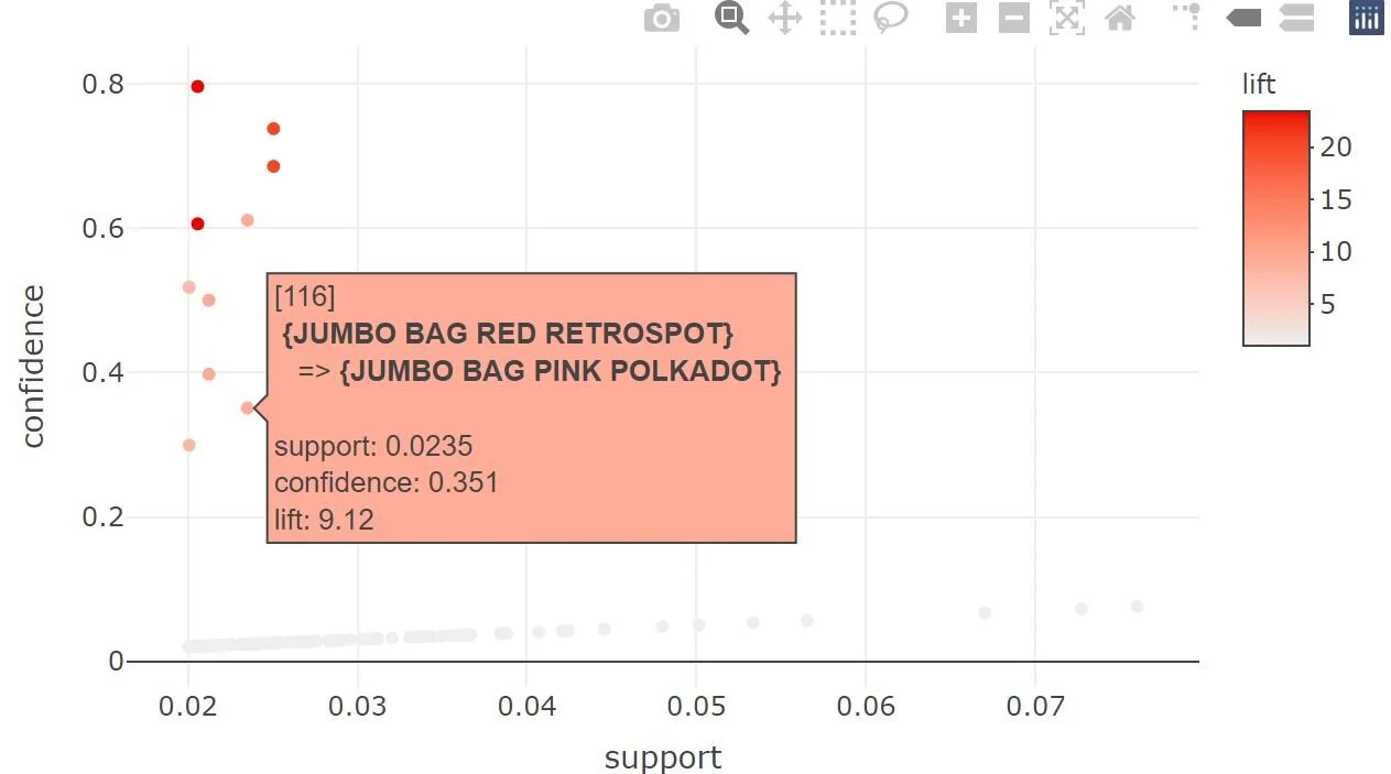
In the above rule, we’re using a minimum support of 2% and minimum confidence of 2% and then trying to find the max lift with recommendations. With plot(rules), your visualization looks like this.
The challenge with this visualization is that you can’t see what’s the recommendation here.
Instead, if you load the plotly package and then plot the rules object, you can now hover over the lift data points to see which particular recommendations will maximize the lift.
This is a much better option than the default arulesViz visualization for lift.
Source: https://www.rdocumentation.org/packages/arulesViz/versions/1.5-0
In the follow up post, will go through the market basket lift visualization in R programming plus Shiny.


