How To Find Outliers in Boxplots [via R Programming]
Finding outliers in Boxplots via Geom_Boxplot in R Studio
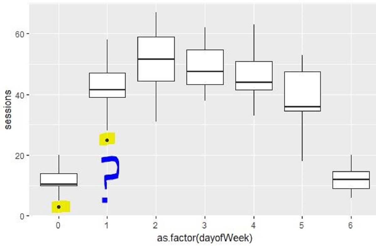
In the first boxplot that I created using GA data, it had ggplot2 + geom_boxplot to show google analytics data summarized by day of week.
While the min/max, median, 50% of values being within the boxes [inter quartile range] were easier to visualize/understand, these two dots stood out in the boxplot.
If the whiskers from the box edges describes the min/max values, what are these two dots doing in the geom_boxplot?
Using a dplyr package to provide summary stats for geom_boxplot
After asking around, I found out a dplyr package that could provide summary stats for the boxplot [while I still haven't figured out how to add the data labels to the boxplot, the summary table seems like a good start].
This bit of the code creates a summary table that provides the min/max and inter-quartile range.
If you download the Xlsx dataset and then filter out the values where dayofWeek =0, we get the below values:
3, 5, 6, 10, 10, 10, 10, 11,12, 14, 14, 15, 16, 20
N = 14
Central values = 10, 11 [50% of values are above/below these numbers]
Median = (10+11)/2 or 10.5 [matches with the table above]
Smallest value = 3
Largest value = 20
Lower Quartile Value [Q1]: = (7+1)/2 = 4th value [below median range]= 10
Upper Quartile Value [Q3]: (7+1)/2 = 4th value [above median range] = 14
Inter Quartile Range = 14-10 = 4
If we want to know whether the first value [3] is an outlier here,
Lower outlier limit = Q1 - 1.5 * IQR = 10 - 1.5 *4
Lower outlier limit = 4
Upper outlier limit = Q3 + 1.5 *IQR = 14 + 1.5*4
Upper outlier limit = 20
As 3 is below the outlier limit, the min whisker starts at the next value [5],
As all the max value is 20, the whisker reaches 20 and doesn't have any data value above this point.
And there's the geom_boxplot explained. Kinda cool it does all of this automatically!
Hope you found this blog post helpful
YouTube video explaining the outliers concept.

![How To Find Outliers in Boxplots [via R Programming]](https://images.squarespace-cdn.com/content/v1/5640e86be4b031347f7c7b81/1597388252274-TQ257RC64WIVK5088XBI/geom_boxplot+with+outlier+values.JPG)


![How To Create Google Analytics Segments [Conditional Data Pulls] In R Studio](https://images.squarespace-cdn.com/content/v1/5640e86be4b031347f7c7b81/1527536580402-ELT919HGY0OMMWE1G7P4/Rplot01.jpeg)

![Analyze Day Of Week GA Data via R Programming [Geom_Boxplots]](https://images.squarespace-cdn.com/content/v1/5640e86be4b031347f7c7b81/1597388614762-AEM1BNISZJ71ZVL90JYE/GGplot2+geom_boxplot+with+google+analytics+day+of+week+data.JPG)

